The Bride's Circle
Bridesmaid Dress Colors: Palettes That Photograph Well
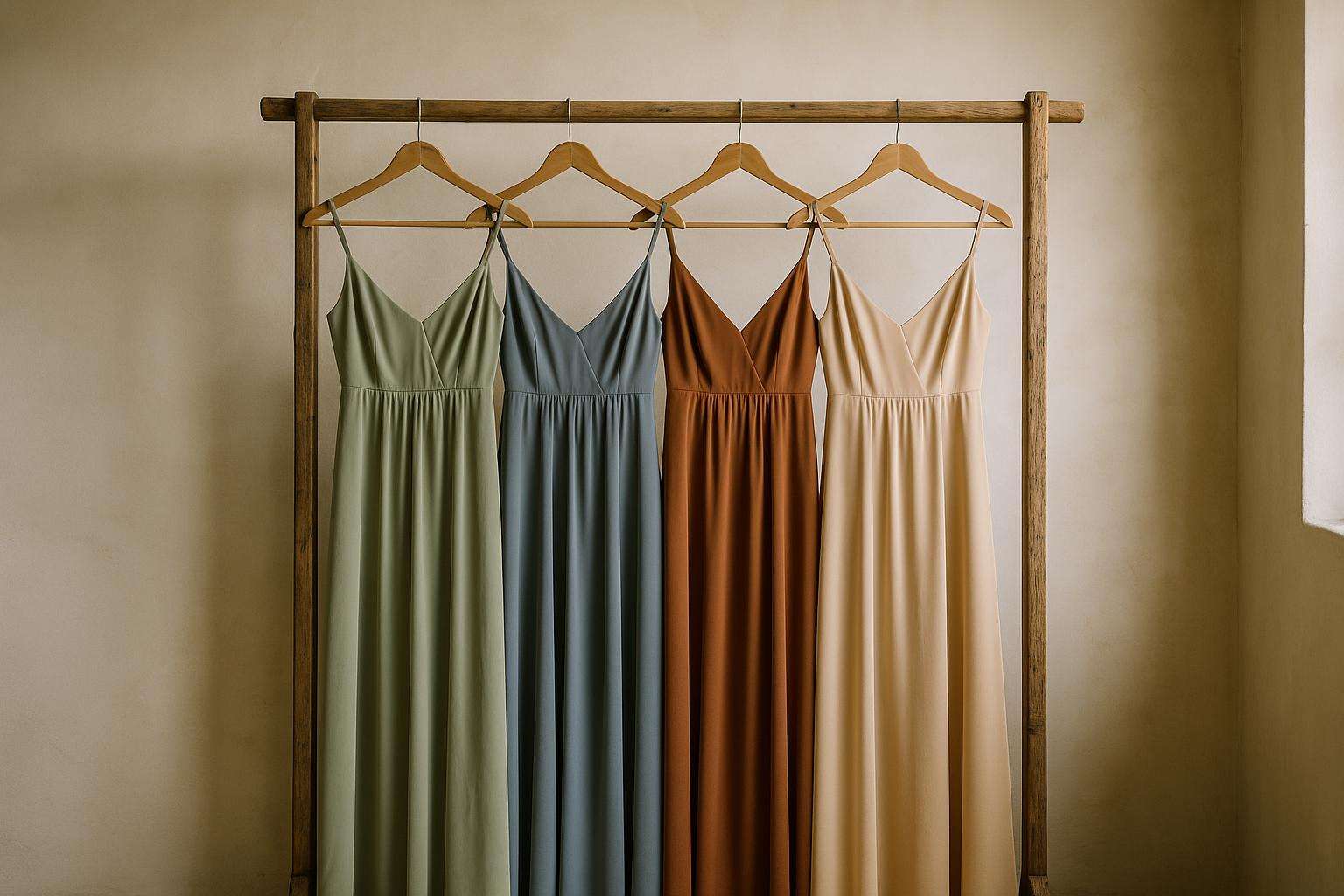
Sage green, dusty blue, terracotta, sky blue — the palettes taking over 2026 wedding photographs, mapped to season, skin tone, and the exact fabric-swatch test that makes the final decision obvious.
The most photographically successful bridesmaid dress colors in 2026 — sage green, dusty blue, terracotta, sky blue, and champagne — work because they flatter a range of undertones, hold up across natural and artificial light, and harmonize with the nature-inspired palettes dominating contemporary wedding aesthetics. Choosing the right one requires matching season, skin tone, and venue to a physical fabric swatch, not a screen image.
Few wedding decisions carry as much visual weight in the final photographs as bridesmaid dress color. The shade must work simultaneously across a group of people with different complexions, at a venue with its own light quality and palette, in a season with distinct color logic, and against a wedding dress that anchors the entire scheme. Get it right and the photographs look effortlessly cohesive. Get it wrong and every image records the evidence.
What follows is a grounded guide to the palettes that are genuinely performing in 2026 weddings — drawing on trend data from Kennedy Blue, Rocky Mountain Bride, and Weare Rewritten, skin-tone guidance from The Dessy Group and Azazie, and seasonal color logic from Adrianna Papell and Pronovias — along with a swatch-testing protocol that makes the final decision obvious rather than agonizing.
What Bridesmaid Dress Colors Are Trending in 2026?
The four dominant bridesmaid dress colors running through 2024 to 2026 have been sage green, dusty blue, terracotta, and champagne. Kennedy Blue — a major online bridesmaid dress retailer founded out of The Wedding Shoppe in St. Paul, Minnesota — names Sky Blue as its number-one trending color for 2026, with sage green close behind. Weare Rewritten's 2026 colour forecast identifies olive, sage, and dusty blue as the breakout shades replacing the blush-heavy palettes of the early 2020s.
Two newer contenders deserve attention. Mocha — a warm, earthy brown — hit the most-requested spot at several retailers in 2025 and carries into 2026 for its crossover appeal between neutral and interesting. Desert Rose — a sun-baked mauve described by Rocky Mountain Bride as the 'it' bridesmaid color for 2026 — leans more editorial and fashion-forward than the blush tones it is gradually displacing.
The overarching aesthetic shift is clear: away from soft pastel pink and toward muted, dimensional, nature-inspired tones that read with depth in both film and digital photography. Mix-and-match within a single color family — varying shades of sage, or pairing olive with eucalyptus and sage — has become the dominant styling approach for 2026 bridal parties, replacing the strict uniformity of earlier seasons.
| Year | Breakout Shades | Overarching Trend |
|---|---|---|
| 2024 | Sage green, dusty blue, champagne | Continued dominance of neutral botanicals from 2023 |
| 2025 | Terracotta, mocha, desert rose | Earth tones surging; mocha named most-requested new color at multiple retailers |
| 2026 | Sky blue, olive, dusty slate, desert rose | Moody dimensional blues; botanical earth tones; blush retreating |
Which Bridesmaid Dress Colors Work Best by Season?
Seasonal color alignment is a reliable framework because each season carries its own natural light quality, venue palette, and floral character. The shades that work in spring garden light look different under fall foliage or winter ballroom tungsten — and the right dress color will harmonize with all of those conditions simultaneously.
Spring
Spring weddings support soft, luminous tones that read well in bright natural daylight. Blush pink and dusty rose remain spring staples; sage green is now the single most-requested outdoor and garden-wedding color. Lilac and mint green complete the classic spring palette. Adrianna Papell's spring editorial recommends champagne as a universally flattering neutral that photographs particularly cleanly under natural daylight — it neither competes with floral color nor washes against a white or ivory gown.
Summer
Summer weddings can carry more expressive, saturated color. Coral, aqua blue, and sunshine yellow channel warm-weather energy. For sunset or evening receptions, navy and even black create unexpected contrast and allow the bride to stand out — especially effective in lightweight chiffon or satin that keeps the bridal party cool. Pronovias' seasonal color guide notes that summer's stronger, more directional natural light allows higher-saturation shades to read cleanly without looking harsh.
Fall / Autumn
Fall is where terracotta earns its reputation. Kennedy Blue describes it as 'soft and earthy — pink and orange with hints of brown — extra stunning for summer and fall weddings.' Burgundy, copper, rust, and mocha brown are complementary fall shades. Deep chocolate pairs particularly well with seasonal foliage at vineyard and barn venues. Adrianna Papell's autumn editorial also recommends amber and wine for deeper fall formality, when the golden quality of evening light lifts warm tones to their richest.
Winter
Winter weddings can carry the richest colors in the bridesmaid palette. Emerald green, steel blue, rich jewel tones (plum, sapphire, wine), and deep red all hold up beautifully under tungsten ballroom light and contrast powerfully against snowy or candlelit backdrops. Dusty neutrals — taupe, charcoal, mauve — provide a softer alternative for brides who want winter elegance without full jewel-tone saturation. Pronovias recommends coordinating with the venue's own color story: a candlelit ballroom calls for deeper, warmer tones; a white winter landscape opens the palette to cooler, high-contrast shades.
What Bridesmaid Dress Colors Flatter All Skin Tones?
The key insight from bridal stylists at The Dessy Group and Azazie is that undertone — warm, cool, or neutral — matters more than skin depth when choosing bridesmaid dress colors. The same shade can flatter one bridesmaid and clash with another even when their complexions appear similar at a glance.
Warm Undertones
Bridesmaids with warm undertones (golden, peachy, olive) glow in earthy shades: champagne, copper rose, desert rose, terracotta, and coral. Colors with yellow or golden undertones bring warmth forward without washing the complexion out. The Dessy Group specifically identifies champagne and warm coral as optimal for warm-undertone bridesmaids across a range of skin depths.
Cool Undertones
Cool undertones (pink, red, or bluish cast) look most radiant in jewel tones and cool-based shades: navy, emerald, burgundy, aubergine, and deep plum. For softer options, lilac, French blue, and dusty mist work well. MB Bride & Special Occasion — a Maryland bridal salon — advises that icy blues and stark purples can make warm-undertone skin look flat, while the same shades make cool-undertone skin luminous. The principle runs in both directions: choosing the wrong color for an undertone doesn't just fail to flatter, it actively detracts.
Neutral Undertones
Neutral-undertone bridesmaids have the most flexibility. Dusty blue, sage green, and soft champagne are identified by both Azazie and The Dessy Group as the most universally flattering shades for neutral complexions — and, crucially, as the safest options when the group's undertones are mixed or unknown.
Strategy for Mixed Groups
The most practical approach for a diverse bridal party is to choose a color family rather than a single exact shade, then allow variation within it. Mixing soft rose, dusty pink, and mauve within a blush palette — or pairing olive with eucalyptus and sage within a green palette — creates visual interest while keeping each bridesmaid in a tone that suits her individual undertone. Midnight navy is widely cited as the single safest anchor color when undertones vary dramatically across the group: it is one of the few shades that reads as flattering against both warm golden complexions and cool pink-toned ones without adjustment.
How Do I Match Bridesmaid Dress Colors to My Wedding Dress?
The foundational principle: the bridesmaid palette should complement the bridal gown, never compete with it. Begin with the white tone of your dress. A warm ivory or champagne gown calls for bridesmaid colors in warm families — terracotta, champagne, copper rose, sage green. A cool white or diamond-white gown pairs more cleanly with cool-based colors like dusty blue, navy, lavender, or emerald.
Azazie's color-matching guide applies the 60-30-10 rule to the overall wedding palette: treat bridesmaid dresses as approximately 60 percent of the primary color, florals and linens as 30 percent secondary, and accent details — jewelry, ribbon, foliage — as the final 10 percent. Exact matchy-matchy coordination reads as flat in photography; complementary color creates depth. A champagne bridesmaid palette against ivory bridal with sage green florals, for example, photographs with far more dimension than a scene where every element matches identically.
One specific pitfall: a warm champagne wedding dress can clash against a cool-white or diamond-white gown in ways that are entirely invisible on a mood board but immediately apparent in person and in photographs. This is precisely why physical swatch testing — covered in the next section — is non-negotiable rather than optional.
How Do You Use Fabric Swatches to Choose Bridesmaid Dress Colors?
The most common mistake brides make is choosing a bridesmaid dress color based on a screen image. Screen calibration and photograph processing shift hues significantly — two shades that appear nearly identical on a monitor can read very differently side by side in person.
Step 1 — Order in multiples. The Dessy Group recommends ordering swatches in three to five shades near your target color, not just the one you think you want. Adjacent tones on a color card often look nearly identical on screen but read very differently in person. The Dessy Group offers five free swatches (paid shipping); Kennedy Blue and Azazie both operate free swatch programs.
Step 2 — Match the fabric, not just the color. Satin makes a color appear more saturated and dramatic; chiffon and soft matte fabrics soften the same hue. Order swatches in the actual fabric your bridesmaids will be wearing — a sage green in chiffon and sage green in satin are meaningfully different shades on a standing person.
Step 3 — Test in venue lighting. Natural daylight, church candlelight, and ballroom tungsten all shift color perception. Azazie's style guides recommend comparing swatches at the actual venue, alongside venue photographs, floral samples, and your wedding dress.
Step 4 — Hold swatches against your gown. The goal is to confirm the bridesmaid color complements your bridal gown without competing — a visual harmony test that a mood board cannot perform.
Step 5 — Apply the 60-30-10 rule. Before committing, lay out the swatch against your planned floral and linen palette to confirm the color relationships across all three elements of the wedding's visual scheme.
Step 6 — Hold swatches near actual faces. Before finalizing, bring swatches to a bridesmaid gathering and hold each near actual complexions — not just the bride's. This step catches undertone mismatches that a solo swatch test misses entirely.
Where Do You Shop for Bridesmaid Dresses — and What Do They Cost?
Most bridesmaid dresses fall between $100 and $300, with the national average landing around $130 to $150, plus an additional $30 to $100 for alterations, according to Zola's expert wedding advice. The landscape covers a wide spectrum from online-only retailers to national salon chains carrying designer labels.
| Retailer | Price Range | Color Selection | Key Strength |
|---|---|---|---|
| Azazie | From $69 | 90+ colors, sizes 0–30 | Free swatch program; custom sizing at no extra cost; dusty blue, terracotta, champagne all stocked |
| Kennedy Blue | $99–$149 | 88 colors, sizes 00–32 | Free home try-on; Slate Blue and Terracotta featured 2026 colors; champagne best-selling neutral |
| The Dessy Group (Alfred Sung, After Six) | $200–$400+ | Designer range; salon-distributed | Five free swatches; in-person salon try-on; designer construction and fabrication |
| Adrianna Papell via Bella Bridesmaids | $200–$350+ | Platinum collection; seasonal palettes | Stylist-guided appointments; Bella Bridesmaids national salon network |
| Jenny Yoo | $250–$400+ | Green spectrum: sage, moss, olive, emerald, eucalyptus | Premium texture-forward fabrications in crepe, velvet, satin, chiffon; best green range in the market |
One practical note on the shopping process: if you are doing a bridal appointment at a salon that carries The Dessy Group, Adrianna Papell Platinum through Bella Bridesmaids, or a comparable designer line, ask to pull bridesmaid swatches during the same appointment. Seeing bridesmaid color options in the context of your gown — under fitting-room lighting, against the actual fabric — is significantly more useful than any amount of online research. The proportion shift between dusty blue in chiffon and the same shade in satin, or between sage green at 90 colors on a website and sage green against your ivory ballgown in a fitting room, can only be understood in person.
Considered Counsel
Frequently asked
What bridesmaid dress colors are trending in 2026?
Sky blue is Kennedy Blue's number-one trending color for 2026, with sage green close behind — and Weare Rewritten's 2026 colour forecast identifies olive, sage, and dusty blue as the breakout shades displacing the blush-heavy palettes of the early 2020s. Rocky Mountain Bride places mocha and desert rose (a sun-baked mauve) among the most-requested new arrivals, while terracotta continues its run from 2025 into the new year. The overarching shift is away from soft pastel pink and toward muted, dimensional, nature-inspired tones — earthy greens, botanical slates, warm neutrals — that read with editorial depth in both film and digital photography. Mix-and-match within a single color family (varying shades of sage, or blending olive with eucalyptus) is the dominant styling approach for 2026 bridal parties.
What bridesmaid dress color is most universally flattering across different skin tones?
Dusty blue, sage green, and soft champagne are identified by both Azazie and The Dessy Group as the three most universally flattering bridesmaid dress colors for a mixed bridal party. The key principle — consistent across bridal stylists at The Dessy Group, Azazie, and MB Bride & Special Occasion in Maryland — is that skin undertone (warm, cool, or neutral) matters more than depth. Midnight navy is widely cited as the single safest option when undertones vary dramatically across the group, because it is one of the few shades that reads as flattering against both warm golden complexions and cool pink-toned ones. Bright, high-saturation colors (vivid yellow, electric coral, stark white) carry the highest risk of flattering some bridesmaids and washing out others.
Which bridesmaid dress colors work best for a fall wedding?
Terracotta is the defining fall bridesmaid color — Kennedy Blue describes it as 'soft and earthy, pink and orange with hints of brown, extra stunning for summer and fall weddings.' Burgundy, copper, rust, mocha brown, and deep chocolate complete the fall palette and all perform exceptionally well against autumnal foliage at vineyard and barn venues. Adrianna Papell's seasonal editorial recommends amber and wine for deeper fall formality. Deep chocolate pairs particularly well with seasonal greenery and aged-wood backdrops at estate and barn settings. For a slightly softer fall look, dusty rose and warm mauve bridge the gap between summer and the richer autumn tones without committing to full-depth jewel colors. These warmer, saturated shades also hold up beautifully under the amber and golden lighting typical of fall reception venues.
How do I match bridesmaid dress colors to my wedding dress?
The foundational principle is complementing rather than competing with your bridal gown. Begin with the white tone of your wedding dress: a warm ivory or champagne gown calls for bridesmaid colors in warm families — terracotta, champagne, copper rose, sage — while a cool white or diamond-white gown pairs more cleanly with cool-based colors like dusty blue, navy, lavender, or emerald. The Dessy Group recommends testing fabric swatches against the actual wedding dress under the ceremony's lighting conditions, not just a digital mood board. Azazie's color-matching guide applies the 60-30-10 rule: bridesmaid dresses carry roughly 60 percent of the palette's primary color, florals and linens provide 30 percent secondary, and accent details (jewelry, ribbon, foliage) contribute the final 10 percent. Exact matchy-matchy coordination reads as flat in photography; complementary color creates visual depth.
Should bridesmaid dress colors match the wedding season?
Seasonal color alignment is a reliable guiding principle but not a strict rule. In practice, certain shades resonate with each season because of how they interact with that season's natural light, venue aesthetics, and floral palette. Sage green, blush, and champagne read naturally in spring garden light; coral, aqua blue, and navy suit summer's saturation; terracotta, burgundy, and mocha align with fall foliage; emerald, steel blue, and deep jewel tones hold up under winter ballroom lighting and contrast beautifully against candlelit or snow-covered backdrops. Pronovias' seasonal color editorial and Adrianna Papell's spring and summer guides both support this framework. That said, a sage green or dusty blue wedding can work beautifully in winter when it is intentional — season is context, not constraint.
What is the difference between sage green and dusty sage for bridesmaid dresses?
Sage green is a grey-green with a cool, botanical quality and a slightly higher saturation — the shade most commonly associated with garden and vineyard weddings. Dusty sage is a more muted, greyed-down version of the same hue with less green presence; it reads closer to a warm neutral and has a softer, more antique quality in photographs. In practical terms: sage green tends to read more 'present' on camera, particularly in natural light, while dusty sage recedes slightly and blends into a softer, more tonal palette. Jenny Yoo — whose green spectrum includes sage, moss, olive, eucalyptus, and emerald — distinguishes these as distinct colorways in their bridesmaid dress line. Fabric also matters: in satin, sage green reads significantly richer and more saturated than the same hue in chiffon. Order swatches in both before deciding.
How do I use fabric swatches to choose bridesmaid dress colors?
Physical swatches are non-negotiable because screen calibration and photography processing shift hues significantly — two shades that appear identical on a monitor can read very differently side by side in person. The Dessy Group recommends ordering three to five adjacent shades from your target color area, not just the one you think you want. Order swatches in the actual fabric your bridesmaids will wear: satin makes a color appear more saturated and dramatic, while chiffon and matte fabrics soften the same hue. Test swatches under venue lighting — natural daylight, candlelight, and ballroom tungsten all shift color perception measurably. Hold swatches against your actual wedding dress to check for gown-color clashes that a mood board won't reveal. Most importantly, hold swatches near the faces of actual bridesmaids to catch undertone mismatches before ordering. Azazie, Kennedy Blue, and The Dessy Group all offer free or low-cost swatch programs.