The Bride's Circle
Mother of the Bride Dress Colors: What to Wear (and Avoid)
From the never-white rule to the 60-30-10 palette framework — a grounded color guide for mothers navigating bridesmaid coordination, MOG pairing, and skin-tone flattery in 2026.
Never wear white, ivory, cream, champagne, or off-white without the bride's explicit permission — these shades can photograph as bridal. Beyond that rule, the MOB's color job is threefold: stay within (but distinct from) the bridesmaid palette, complement rather than clone the mother of the groom's look, and choose a hue that flatters her own undertone and complexion in photographs.
The color a mother of the bride chooses on a wedding day communicates as much as the dress itself. It signals respect for the couple's aesthetic, awareness of tradition, and a certain quiet confidence in one's own sense of style. The good news: the field of genuinely beautiful, socially appropriate options is vast. The restrictions, once understood, actually make the decision easier — not harder. This guide walks through the rules that hold, the ones that have softened, and the practical frameworks for making a color choice you will feel certain about in every photograph.
What colors can the mother of the bride NOT wear?
The foundational color rule for MOB dressing is well established and still matters: do not wear anything that could be confused with the bride. In practice, that means steering clear of white, ivory, cream, champagne, and off-white unless the bride explicitly grants permission. These shades can read as bridal under the bright flash photography and diffused artificial lighting common at wedding receptions, even when they look perfectly distinct to the naked eye in a department store. The Knot's editorial guidance describes this rule as close to absolute, citing the permanence of wedding photography — once the photos are printed, there is no reshooting the family portrait where the mother appeared to be wearing a second bridal gown.
Black occupies more nuanced territory. Traditional wedding etiquette in many cultures treated black as mourning dress — a signal of disapproval of the marriage itself. That connotation is largely obsolete at contemporary American weddings, particularly formal or evening receptions where a beaded or flowing black gown reads as sophisticated rather than somber. Jovani's dress etiquette guide notes that black with "lace, beading, or flowing fabrics" is celebratory when accessorized with vibrant jewelry or a metallic clutch. David's Bridal's published guidance is more cautious: consult the bride first, as some couples prefer a lighter, brighter aesthetic throughout the bridal party. The rule holds at daytime religious ceremonies or gatherings with older guests from certain cultural backgrounds, where black may still carry its historical weight.
Bright red is the third color that traditional guidance flags — not for cultural reasons, but because a saturated true red in a sea of ceremony attendants draws the eye with the same urgency as a stop sign. Deeper reds — burgundy, wine, merlot — are widely recommended as flattering alternatives, particularly at fall and winter weddings where they photograph beautifully against amber and candlelit settings.
The operating principle that has replaced rigid prohibition in the 2025–2026 wedding landscape: communicate before purchasing. Whatever the color, the MOB should share the choice with the bride — a brief conversation that takes two minutes and eliminates the entire category of regrettable surprises.
How should the mother of the bride coordinate with the bridesmaids?
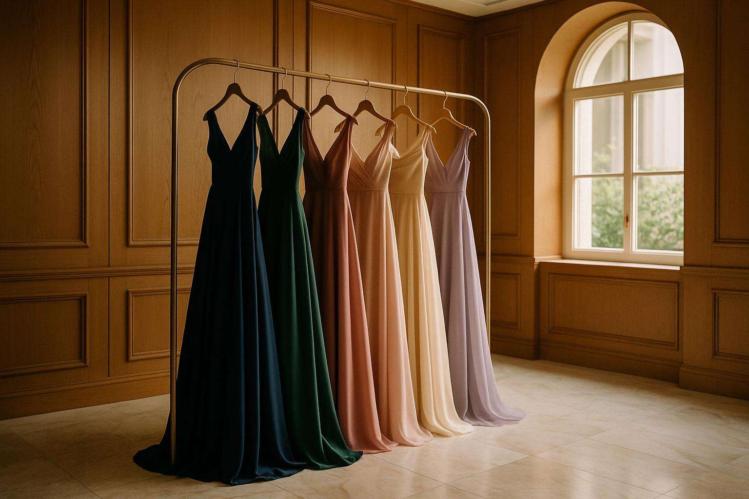
The MOB dress should function within the wedding's color story without duplicating it. The most widely recommended approach is what wedding stylists at Azazie and Irini's Originals call the sister-shade method: choose a hue in the same color family as the bridesmaids, but at a different depth or saturation level. The MOB occupies a distinct social role from the attendants — her dress should echo the palette, not repeat it.
Practical translations of the sister-shade method:
- Bridesmaids in dusty blue → MOB in deep navy, slate blue, or soft pewter silver
- Bridesmaids in sage green → MOB in forest green, hunter green, or antique gold
- Bridesmaids in blush → MOB in deeper mauve, wine, or warm champagne gold
- Bridesmaids in burgundy → MOB in deep plum, midnight navy, or muted rose gold
An alternative framework is the secondary palette method: draw from a color the couple uses in their wedding decor or stationery, separate from the primary bridesmaid hue. If the bridesmaids are in emerald green but the couple's palette also incorporates ivory and gold, the MOB can wear antique gold without touching the green family at all. Chantal's Bridal notes this secondary-color strategy photographs particularly well because it creates palette cohesion without visual repetition — the MOB reads as part of the color story without blending into the attendants.
The 60-30-10 palette framework used in interior design translates neatly to wedding color coordination: 60% of the visual field in the bridal party's primary color, 30% in the MOB and MOG's complementary tones, and 10% in accent metallics and florals. When the MOB and MOG work within that 30% zone — distinct from the bridesmaids but harmonious with the overall scheme — the wedding photographs cohere effortlessly.
| Bridesmaid Color | MOB Sister Shade | MOB Secondary Option | Colors to Avoid |
|---|---|---|---|
| Dusty blue | Deep navy, slate blue | Soft silver, pewter | Matching dusty blue, white |
| Sage green | Forest or hunter green | Antique gold, champagne | Matching sage, bright yellow |
| Blush / dusty rose | Deeper mauve, wine | Warm champagne gold | Matching blush, ivory, white |
| Burgundy / wine | Deep plum, midnight navy | Rose gold, antique bronze | Matching burgundy, bright red |
| Lavender | Amethyst, eggplant | Soft silver, dusty rose | Matching lavender, white |
| Emerald green | Deep teal, hunter green | Gold, antique champagne | Matching emerald, bright lime |
How should the mother of the bride coordinate with the mother of the groom?
Traditional etiquette assigns the MOB first pick: she selects her dress, then shares the color family, length, and formality level with the mother of the groom, who shops for a complementary — not matching — look. This convention exists because the MOB is more directly linked to the bridal party's visual landscape, giving her choice a logical anchor role. The MOG's dress should sit harmoniously in the same formality tier and photograph well alongside the MOB's look without duplicating it.
Complementary pairings that work consistently across venue types and formality levels include:
- Champagne (MOB) + sage green or dusty teal (MOG)
- Navy (MOB) + dusty blue or pewter silver (MOG)
- Dusty rose (MOB) + taupe, mocha, or warm grey (MOG)
- Emerald (MOB) + antique gold or blush (MOG)
The one coordination rule that is non-negotiable: formality must match. If the MOB wears a floor-length gown, the MOG should not arrive in a cocktail-length dress. Mismatched lengths read as visually disjointed in wedding photographs regardless of how beautiful each dress is individually. The Knot advises agreeing on formality first, before any discussion of color, as the single most useful coordination step between the two families.
How do I choose a mother of the bride dress color for my skin tone?
Color flattery is physiological as well as aesthetic. Azazie's color editorial and Belle Amour Bridal's styling guide both organize recommendations around undertone — the warm, cool, or neutral cast beneath the surface of the skin — rather than simply light or dark complexion. Undertone is the more reliable variable because it determines which hues photograph as complementary versus washing out or clashing.
Cool undertones (veins appear blue-purple; silver jewelry flatters): sapphire blue, amethyst, icy lavender, deep navy, berry, and cool silver metallics photograph best. Warm-based colors — orange, yellow-gold, bronze — can drain warmth from cool-undertone skin and read as sallow in photographs.
Warm undertones (veins appear green; gold jewelry flatters): earthy jewel tones amplify the skin's natural warmth — mustard, burnt orange, warm coral, olive, deep red, and bronze metallics all work beautifully. Icy pastels, particularly pale lavender and cool silver, can clash against warm skin and appear washed out under direct flash.
Neutral undertones have the widest latitude: both gold and silver metallics work well; blush, soft grey, and dusty rose are especially elegant; jewel tones in any family suit this group. If you are uncertain of your undertone, this is the safest profile to shop for broadly.
Deep complexions across all undertones benefit dramatically from fully saturated jewel tones — sapphire, emerald, amethyst, rich coral — and bold metallics. These colors stand out against deeper skin in photography far more effectively than washed-out pastels, which can photograph as indefinite and lose their distinction under strong artificial light.
Fair complexions with high contrast (dark hair, light skin) can carry saturated jewel tones effectively. Low-contrast fair coloring — pale hair, pale skin — often photographs most beautifully in tonal, muted shades such as dusty rose, champagne, or soft pewter grey, where the dress and complexion create a coherent, luminous whole rather than competing for attention.
The practical test recommended by Soulmates Dress and echoed by multiple bridal boutiques: hold the fabric near your face in natural light (not dressing room fluorescents), take a photograph on your phone, and evaluate whether your skin looks rested and radiant versus washed out or overshadowed. Azazie's at-home try-on program — three sample dresses for $10 each with free return shipping — is one of the most practical tools available for this exact evaluation, allowing comparison in the actual lighting conditions of home rather than under the flattering controlled light of a boutique.
What are the best mother of the bride dress colors by season?
Season and venue compress the practical color range significantly. Spring and summer weddings favor lighter, airier palettes where heavier saturated tones can feel incongruous; fall and winter weddings invite richness that washed-out pastels simply cannot deliver. The fabric choice reinforces the color: chiffon and georgette carry spring palettes with the lightness they require, while satin, crepe, and velvet give jewel tones the weight and depth that photographs richly in autumn candlelight.
| Season | Recommended Colors | Universally Flattering Anchor | Best Fabrics |
|---|---|---|---|
| Spring | Blush, lavender, sage green, soft teal, light champagne | Dusty rose, soft sage | Chiffon, georgette, lace |
| Summer | Dusty rose, eucalyptus, vintage mauve, dusty sage, soft navy | Navy, champagne | Chiffon, crepe, mesh |
| Fall | Burgundy, emerald, deep navy, plum, antique gold | Burgundy, deep navy | Satin, crepe, velvet |
| Winter | Deep jewel tones, black, metallic gold, metallic silver | Jewel tones, sophisticated black | Velvet, satin, beaded chiffon |
Three anchor colors cited by Kennedy Blue, Morilee, and Kleinfeld Bridal as universally flattering across all seasons and venue types are worth bookmarking: navy (works at every formality level from garden ceremony to black-tie ballroom, flatters nearly every complexion, and photographs with exceptional depth), emerald or forest green (timeless, saturated, and stands out clearly from both bridal white and most bridesmaid palettes), and jewel tones as a category — sapphire, garnet, amethyst — which add richness without competing with the bride and photograph with a depth that pastels simply cannot achieve.
Where can the mother of the bride shop, and what should she expect to spend?
Start shopping six to eight months before the wedding — the consistent minimum recommended by Kleinfeld Bridal, Azazie, and The Knot — to allow for special-order production timelines and at least two rounds of alterations. Waiting until four months out is workable but constrains selection significantly.
Adrianna Papell is the most widely stocked MOB brand in the U.S. market, available at Nordstrom, Macy's, and adriannapapell.com. The 2025–2026 collection welcomes jewel tones, bold colors, and metallics as the default rather than the exception, with one-shoulder and floor-length satin silhouettes prominent. Mid-range pricing makes it accessible across most budgets.
Azazie (azazie.com) offers extensive seasonal MOB collections spanning over 200 styles in 100 colors, sizes 0–30, with free custom sizing on every style — a meaningful advantage for mothers between standard sizes. Styles are priced from approximately $139 to $259+, and the at-home try-on program ($10 for three samples, free return shipping) is among the best tools in the category for color evaluation at home.
Jovani (jovani.com) carries formal MOB gowns across a wide color range including deep blush, navy, and bold jewel tones, priced approximately $300–$1,000 depending on beading and embellishment level. Strong for mothers seeking a more glamorous, embellished presence.
Morilee (morilee.com) and Alyce Paris (alyceparis.com) both offer dedicated MOB collections available through bridal boutiques nationally, with editorial emphasis on jewel tones, sophisticated metallics, and classic neutrals. Sachin & Babi at Saks Fifth Avenue spans approximately $595–$895 for 2025–2026 styles, organized by season and venue type for brides shopping at the designer tier.
Kleinfeld Bridal (kleinfeldbridal.com) in New York curates an MOB selection across designers, with styling guidance that pairs indoor reception venues with richer fabrics and deeper tones, and outdoor or garden celebrations with lighter, more breathable materials. A Kleinfeld appointment provides expert editorial guidance alongside access to a broad multi-designer selection — valuable for mothers navigating the color decision for the first time.
Never wear: white, ivory, cream, off-white (without bride approval); bright red; potentially black (check with bride for religious or daytime ceremonies). Always do: apply the sister-shade or secondary-palette method for bridesmaid coordination; confirm formality alignment with the MOG before shopping; test fabric color in natural light (not boutique fluorescents) and photograph it. Universally safe anchors: navy, emerald, deep jewel tones. Start shopping six to eight months out.
Considered Counsel
Frequently asked
What colors can the mother of the bride NOT wear?
The core list is short but firm: white, ivory, cream, champagne, and off-white are reserved for the bride and should not be worn by the MOB unless the bride explicitly grants permission. These shades can photograph as bridal — even when they look distinct to the naked eye — under the bright flash and diffused light common at wedding receptions. The Knot describes this rule as close to absolute, citing the permanence of wedding photography as the central concern. Bright red is also traditionally flagged as attention-competing, though deeper reds — burgundy, wine, merlot — are widely embraced and recommended, especially for fall and winter weddings. Black occupies nuanced territory: at formal or evening receptions, sophisticated black is broadly accepted in 2026; at daytime religious ceremonies or gatherings with older guests from certain cultural backgrounds, it can read as inauspicious and is worth clearing with the bride first. The guiding principle across all three: when in doubt, communicate before purchasing.
Can the mother of the bride wear black to a wedding?
Yes, in most modern wedding contexts — with important caveats. Traditional wedding etiquette in many cultures treated black as mourning dress, signaling disapproval of the marriage. That association is largely obsolete in contemporary American weddings, particularly at black-tie or evening receptions where a beautifully beaded or elegantly draped black gown reads as sophisticated rather than somber. Jovani's dress etiquette guide notes that black with "lace, beading, or flowing fabrics" is celebratory when accessorized with vibrant jewelry or a metallic clutch. David's Bridal's published etiquette guidance specifically recommends consulting the bride before committing to black — some couples prefer a lighter, brighter aesthetic throughout the bridal party and find all-black jarring in photographs. If the bride is comfortable with the choice, a polished black gown is one of the most timeless and flattering options available to the mother of the bride in 2026.
What color should the mother of the bride wear if bridesmaids are in navy?
When the bridal party is in navy, the MOB has several strong options. The most cohesive approach is the sister-shade method: choose a hue in the same blue family at a different depth or saturation — deep cobalt, slate blue, or soft silver all work well alongside navy without duplicating it. An alternative is to draw from a secondary color in the couple's palette: if the wedding's accents include gold or blush, the MOB can wear champagne gold or a warm blush and step outside the navy family entirely while remaining within the wedding's color story. Chantal's Bridal notes this secondary-color strategy photographs particularly well because it creates visual cohesion without repetition. Metallic options — pewter, silver, antique gold — also coordinate beautifully with navy bridesmaids and add a sense of distinction appropriate to the mother's role. Avoid bright yellow or orange, which can clash sharply with navy in photography regardless of how they look in isolation.
What is the best color for the mother of the bride at a fall wedding?
Fall weddings invite the richest, most saturated end of the color spectrum, and the MOB palette follows suit. Burgundy, wine, and merlot are consistently the top recommendations across Adrianna Papell's editorial, Kleinfeld Bridal's styling guides, and Kennedy Blue's MOB resource — they read as warm and festive without competing with the bride, and they photograph with exceptional depth under the golden and amber light of autumn venues. Emerald green is the second consensus favorite for fall: it bridges the season's natural tones and reads as timeless rather than trend-driven. Deep navy remains a universally strong choice across all seasons, including fall. Plum and antique gold round out the palette for brides seeking something less expected. Fabrics that suit the season include satin, crepe, and velvet, which add appropriate richness and warmth. Avoid pastels in fall — they tend to photograph as washed-out under the lower natural light of October and November ceremonies.
Does the mother of the bride have to match the bridesmaids?
No — and in fact, matching the bridesmaids exactly is considered a style misstep rather than a virtue. The MOB's dress is meant to complement the bridal party's palette, not replicate it. Identical color between the MOB and bridesmaids can read as unintentional in photographs, and it erases the visual distinction between the mother and the attendants — a distinction that matters both aesthetically and socially. The standard approach, endorsed by The Knot, Kleinfeld Bridal, and Azazie's styling guides, is to choose a hue in the same color family at a different depth or tone (the sister-shade method), or to choose a color from the couple's secondary palette that harmonizes without duplicating. The MOB traditionally has first pick — she selects her dress and then shares the color family with the mother of the groom, who chooses a complementary, not matching, shade. That sequencing gives the MOB meaningful creative latitude within the overall palette.
How do I choose a mother of the bride dress color for my skin tone?
Start with undertone, not complexion depth. Cool undertones — where veins appear blue-purple and silver jewelry flatters — look best in sapphire, amethyst, navy, berry, icy lavender, and cool silver metallics. Warm-based colors like orange-gold, bronze, and burnt sienna can wash out cool-undertone skin. Warm undertones — where veins appear green and gold jewelry flatters — are amplified by earthy jewel tones: mustard, warm coral, olive, deep red, and bronze metallics. Icy pastels can clash against warm skin. Neutral undertones work with the widest range: both gold and silver metallics suit this group, and blush, soft grey, and dusty rose are especially elegant. Deep complexions across all undertones benefit from fully saturated jewel tones — sapphire, emerald, amethyst, rich coral — which stand out beautifully in photography in ways washed-out pastels cannot. The universal test: hold the fabric near your face in natural light, take a photograph, and evaluate whether your skin looks rested and radiant. A swatch comparison in-store or through Azazie's at-home try-on program is far more reliable than judging color on a screen.
Is champagne OK for the mother of the bride to wear?
Champagne is a conditional choice, not a default safe one. Under bright wedding reception lighting and camera flash, champagne — particularly in satin and chiffon — can photograph extremely close to ivory and cream, which are bridal shades. Before purchasing a champagne gown, the MOB should confirm the shade with the bride directly and, if possible, compare fabric swatches to the bridesmaids' dresses to ensure champagne won't read as a near-match to any blush or pale neutral in the wedding party. That said, champagne gowns styled with deeper accessories — a statement necklace in garnet or navy, a jeweled clutch, or a wrap in a contrasting tone — can be an elegant and distinctive choice that photographs warmly in golden-hour light. Adrianna Papell and Sachin & Babi both carry champagne MOB styles that are specifically designed with enough warmth and saturation to distinguish clearly from bridal ivory in most lighting conditions. Communication with the couple first is essential.